S&P 500, SPX, NASDAQ 100, NDX – OUTLOOK:
- The S&P 500 index and the Nasdaq 100 index have fallen below key support.
- Extreme optimism, stretched bullish positioning, and higher-for-longer rates appear to be casting a shadow over the multi-month rally.
- What are the outlook and the key levels to watch in the S&P 500 and the Nasdaq 100 index?
Recommended by Manish Jaradi
Improve your trading with IG Client Sentiment Data
The upward pressure in the S&P 500 and the Nasdaq 100 index is finally fading — at least for now.
Extreme optimism stretched bullish positioning, and poor seasonality appears to be casting a shadow on the rally in US indices, as highlighted in the previous update. See “US Indices Rally Beginning to Crack? S&P 500, Nasdaq Price Setups,” published August 3. This coupled with higher-for-longer US interest rates and the associated rise in yields/real yields is leading to a reassessment of the potential risk-adjusted returns for the asset class.
S&P 500 240-Minute Chart
Chart Created by Manish Jaradi Using TradingView
As last week, equities thrived in an environment of near-zero interest rates and negative real rates. However, the rising cost of capital and positive real rates imply that the hurdle for equities to outperform other asset classes is now higher, especially with valuations above historical averages. See “Is Nasdaq Following Gold’s Footsteps? NDX, XAU/USD Price Setups,” published August 14.
Furthermore, momentum on higher-timeframe charts suggests the rally this year is corrective, rather than the start of a new trend in both, the Nasdaq 100 and the S&P 500 index. For more discussion, see “S&P 500, Nasdaq 100 Forecast: Overly Optimistic Sentiment Poses a Minor Setback Risk,” published July 23.
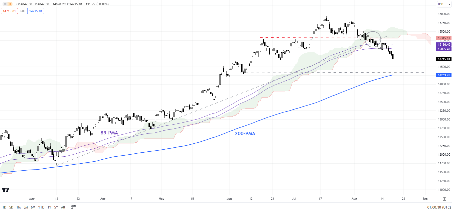
Nasdaq 100 240-Minute Chart
Chart Created by Manish Jaradi Using TradingView
Nasdaq 100: Cracks below support
The Nasdaq 100 index’s drop last week below minor support at 15285-15385 and the subsequent break below the 89-period moving average on the 240-minute charts – for the first time since the rally began earlier this year — has confirmed that the bullish pressure has eased for now. The index looks to test the 200-period moving average (now at about 14275).
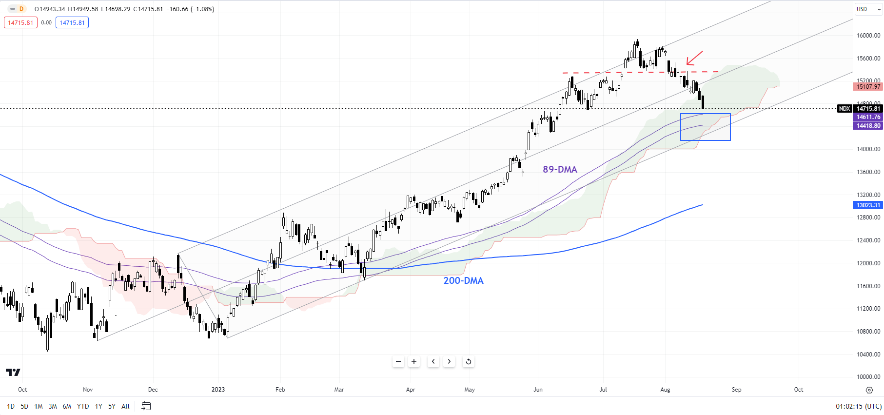
Nasdaq 100 Daily Chart
Chart Created by Manish Jaradi Using TradingView
From a big-picture perspective, as noted in a recent update, monthly charts have been feeble compared with the 50% rally since October (see the monthly chart). See “S&P 500, Nasdaq 100 Forecast: Overly Optimistic Sentiment Poses a Minor Setback Risk,” published July 23. The strength in upward momentum on the daily and weekly charts perhaps masks the anemic conditions on the monthly charts. For more discussion on the bigger picture, see “Is Nasdaq Following Gold’s Footsteps? NDX, XAU/USD Price Setups,” published August 14.
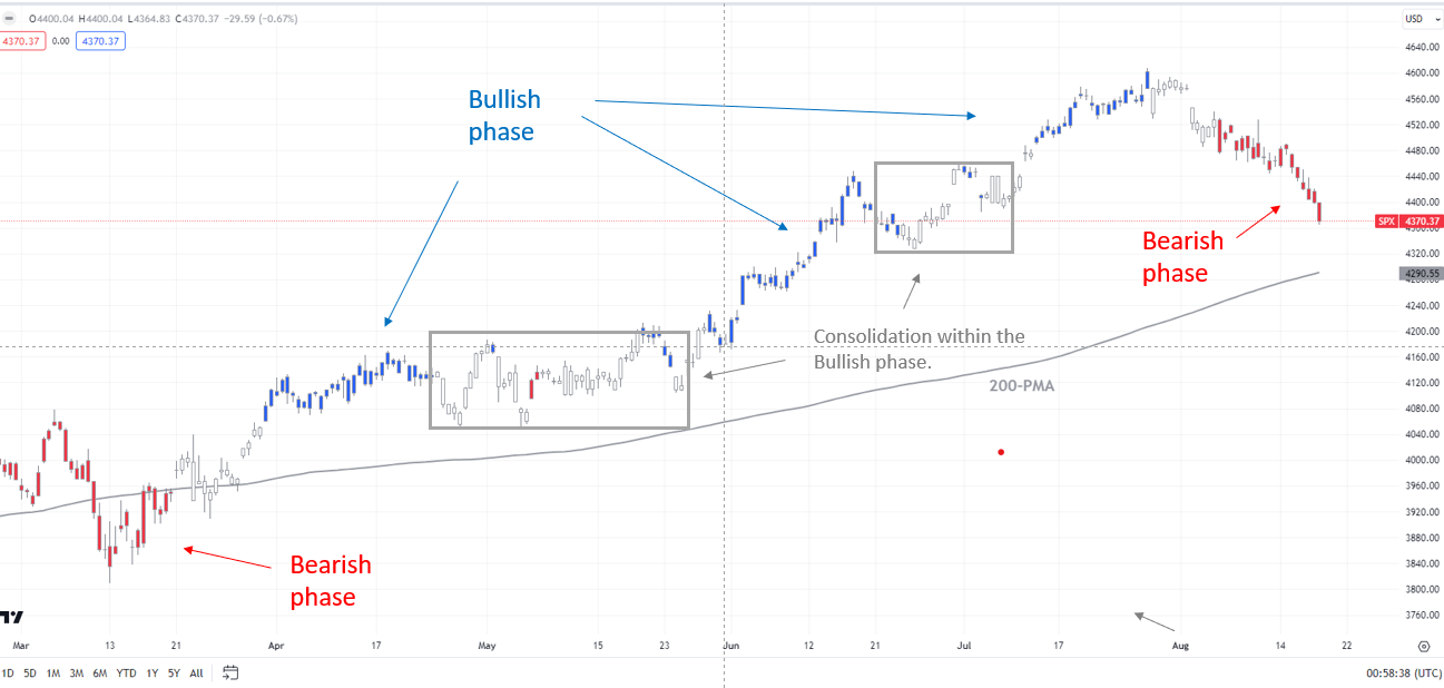
S&P 500 240-Minute Chart
Chart Created by Manish Jaradi Using TradingView;Refer to notes at the bottom of the page.
S&P 500: Breaks below minor support
The S&P 500 index’s recent fall below minor support at the late-July low of 4550 has confirmed that the upward pressure has faded in the near term – a riskhighlighted in late July. This follows a failure to rise past the median line of a rising pitchfork channel from the end of 2022, around the April 2022 high of 4637.
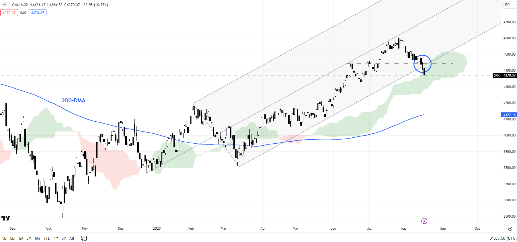
S&P 500 Daily Chart
Chart Created by Manish Jaradi Using TradingView
The short-term trend has changed to bearish as highlighted by the colour-coded 240-minute candlestick charts. The index looks set to fall toward a converged cushion on the lower edge of the Ichimoku cloud on the daily charts, roughly coinciding with the end-June low of 4325 and the 200-period moving average on the 240-minute charts.
Note: The above colour-coded chart(s) is(are) based on trending/momentum indicators to minimize subjective biases in trend identification. It is an attempt to segregate bullish Vs bearish phases, and consolidation within a trend Vs reversal of a trend. Blue candles represent a Bullish phase. Red candles represent a Bearish phase. Grey candles serve as Consolidation phases (within a Bullish or a Bearish phase), but sometimes they tend to form at the end of a trend. Candle colors are not predictive – they merely state what the current trend is. Indeed, the candle color can change in the next bar. False patterns can occur around the 200-period moving average, around a support/resistance, and/or in a sideways/choppy market. The author does not guarantee the accuracy of the information. Past performance is not indicative of future performance. Users of the information do so at their own risk.
Recommended by Manish Jaradi
How to Trade the “One Glance” Indicator, Ichimoku


